Rivet

The Brief
Research and Development
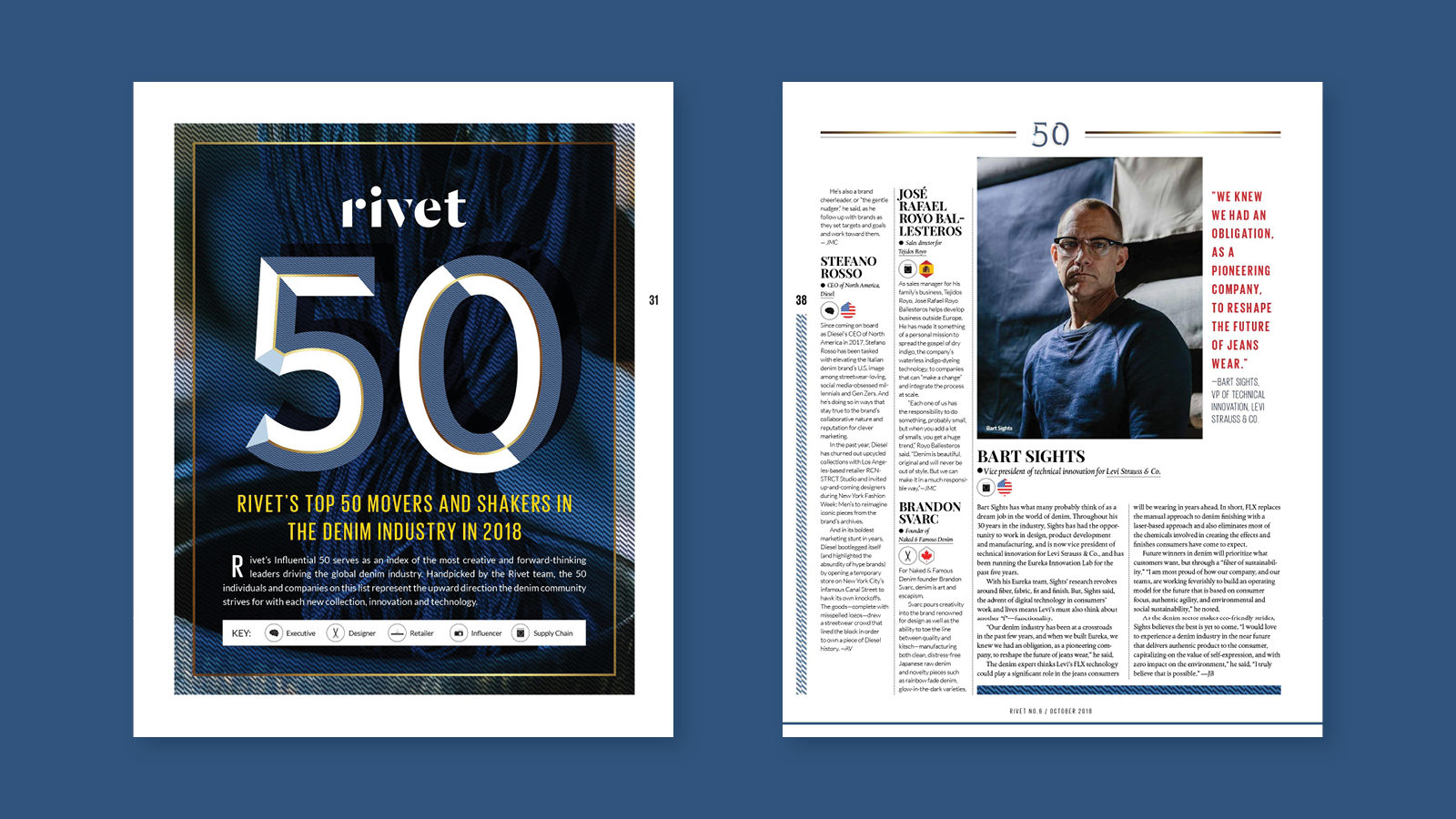
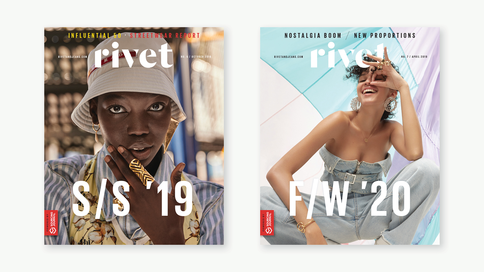
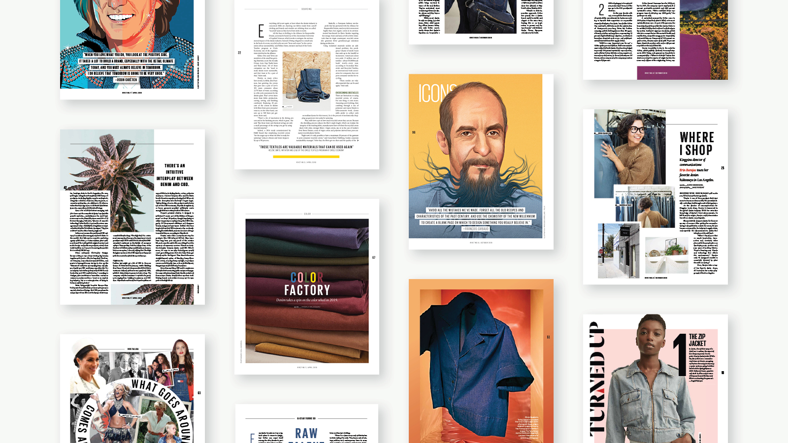
Our first step was to introduce a format change; moving Rivet to a larger spec size helped not only with the visual presence of the magazine, but also creating a more desirable product for advertisers (which saw significant gains post the relaunch). We also reduced the number of cover lines, giving the cover image more resonance, and introduced a seasonal orientated abbreviated header—which helped to establish the publication’s DNA: covering future trends within the denim industry.
The new logo design inspiration derived from the pattern blocks used in the design process—the sharp and curved lines giving it a playful but bold contemporary look. The color palette was created to complemented and heightened the dominant denim color that would appear throughout the magazine and online.
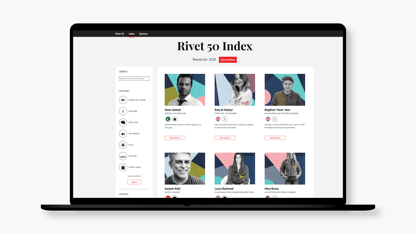
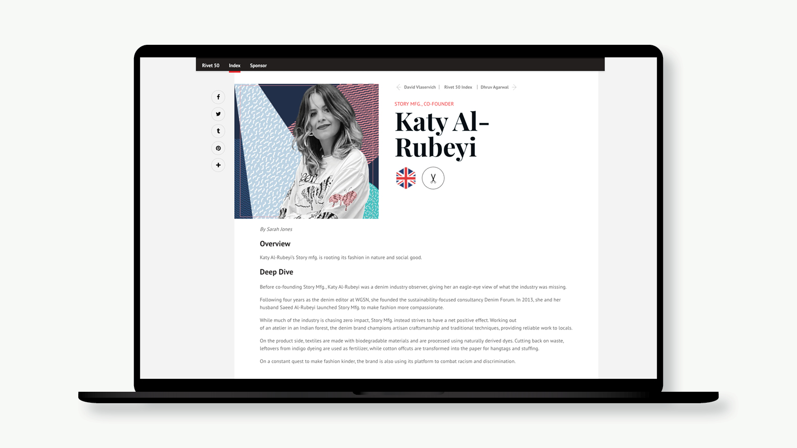
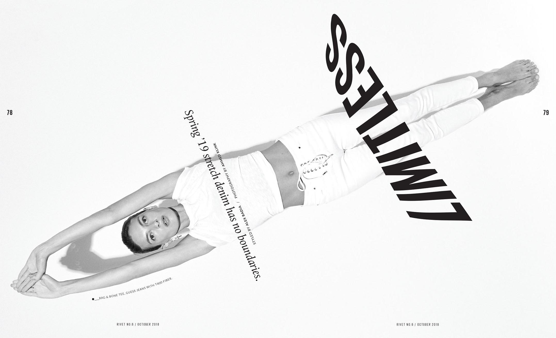
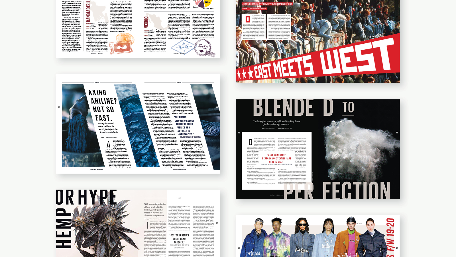
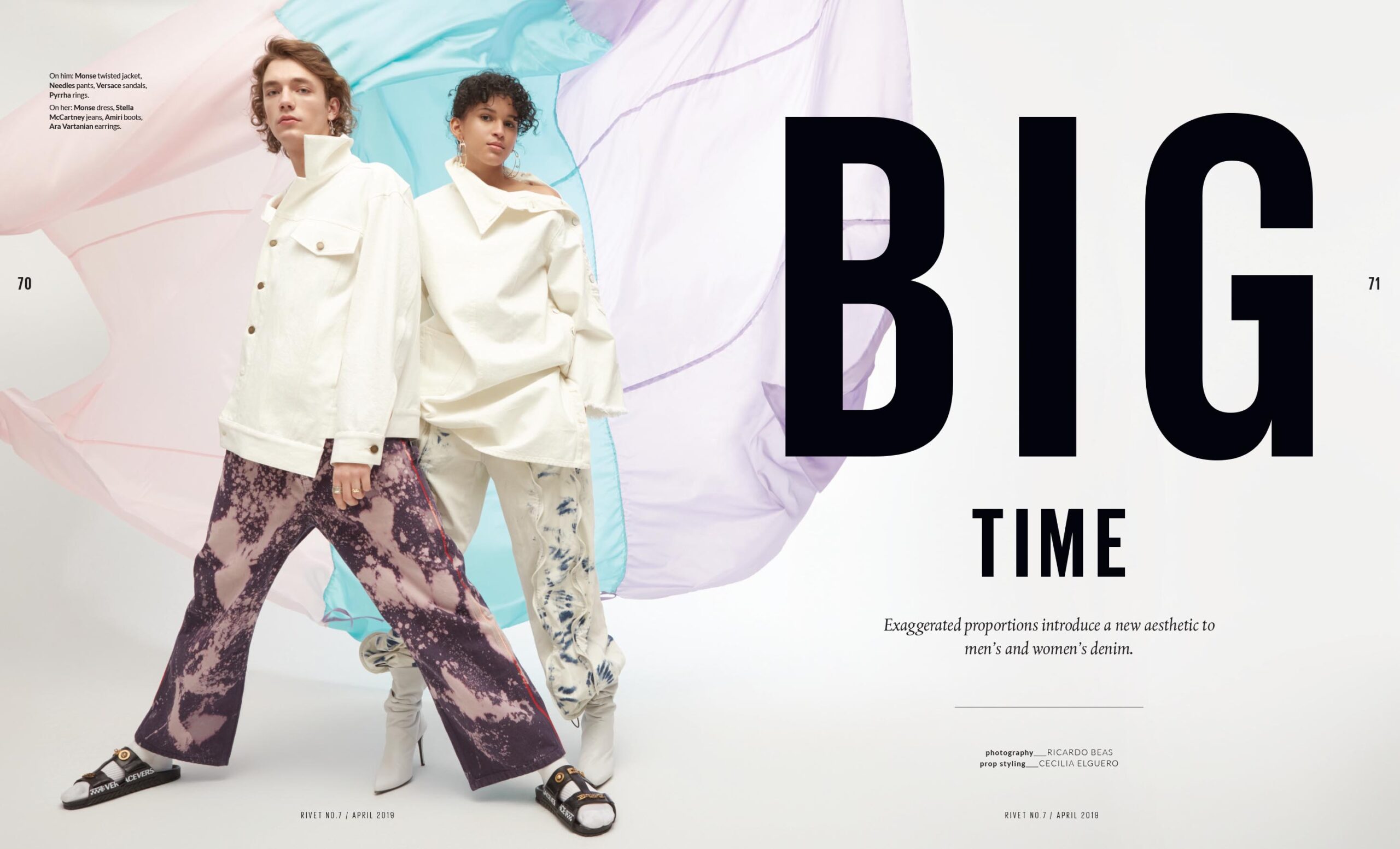
Due to a limited budget we decided on a more graphic approach to the features’ photography and layouts. Using a type driven style we were able to create scale and impact to the layouts. The photography being shot either on the street to give an authentic feel, or in the studio with minimal prop . usage to give a stark and clean look. All creating a playful balance of street chaos, studio minimalism, and dynamic typography.
Another area we knew could both save on budget, as well as make a strong visual impact, was the use of information graphics. Being a B2B title there was an abundance of data, which we put to good use with a series of engaging graphics, all created in house, using the strong color palette, and affordable stock imagery, to great effect.
This has far exceeded my expectations and looks better than any trade publication I've seen!"
Deployment and Results
Rivet 50
